In Questionnaire Builder 2, you add functionality to the pages in your questionnaire by adding Objects. Objects can be either some static content (e.g. some text, an image, a video) or a question (e.g. a text entry, a dropdown, and so on).
This guide lists all the different types of objects you can create. Browse the menu on the left, or click the image examples below to be taken directly to the relevant page for each question type.
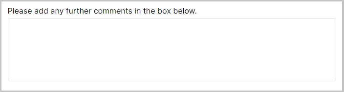
Comment Box
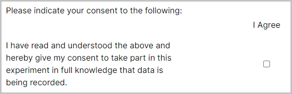
Consent Form
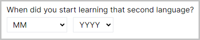
Date Entry
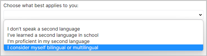
Dropdown
Multiple Choice
Multiple Choice Grid
Number Entry
Ranking Scale
Rating Scale
Slider
Text Entry
Time Entry
The audio object allows you to add uploaded audio files to your page for participants to listen to. Each audio object allows one audio file to be played. For some more information about file size and supported formats, have a look at the information in our Technical Checklist.
Samples that use this object
There are currently no samples that use this object.
Audio File
The audio file to play.
Button Label
Text for the 'Play' button.
Max Plays
Maximum allowed number of plays. Leave blank for unlimited.
Allow advance without playing
If set, the screen can advance even if the audio hasn't played.
Conditional
Control the conditions under which this object should be shown or hidden.
Default State
If conditional, set whether this object should be shown or hidden by default.
Conditions
If conditional, the conditions under which this object should be shown or hidden.
Visibility
Select, from the dropdown, whether this object should be shown or hidden under the condition.
Field
Set the field to use for this condition.
Comparison
Select the type of comparison, from the dropdown, to make for this condition.
Response
Set the response value to compare to the field in this condition.
This object allows you to add images to your questionnaire. Each image object allows you to display a single image. For some more information about file size and supported formats, have a look at the information in our Technical Checklist.
Samples that use this object
Image
Choose the image to display. This can also be bound to a Manipulation or a field in the Store. Learn more about Binding in the Binding Guide.
Max Height (px)
Set the maximum height of the image, in pixels.
Image Align
Use this setting to align the image to the left, center or right.
Conditional
Control the conditions under which this object should be shown or hidden.
Default State
If conditional, set whether this object should be shown or hidden by default.
Conditions
If conditional, the conditions under which this object should be shown or hidden.
Visibility
Select, from the dropdown, whether this object should be shown or hidden under the condition.
Field
Set the field to use for this condition.
Comparison
Select the type of comparison, from the dropdown, to make for this condition.
Response
Set the response value to compare to the field in this condition.
Text objects are used to display markdown-formatted text on the page. This can be used to add instructions and information text etc. You can also use HTML within a Text object to add custom styling.
You can also use this object to retrieve the participant's previous answers from the Store and display them. You can learn more about retrieving from the Store in the How-To Guide.
Samples that use this object
Patient Health Questionnaire (PHQ-9)
Generalised Anxiety Disorder (GAD 7)
Text
The markdown-formatted text that will be displayed to participants on the screen.
Base Text Size (px)
Set the size of the text, in pixels.
Text Align
Use this to align the text to the left, center or right.
Conditional
Control the conditions under which this object should be shown or hidden.
Default State
If conditional, set whether this object should be shown or hidden by default.
Conditions
If conditional, the conditions under which this object should be shown or hidden.
Visibility
Select, from the dropdown, whether this object should be shown or hidden under the condition.
Field
Set the field to use for this condition.
Comparison
Select the type of comparison, from the dropdown, to make for this condition.
Response
Set the response value to compare to the field in this condition.
The video object allows you to add uploaded video files to your page for participants to watch. Each video object allows one video file to be played. For some more information about file size and supported formats, have a look at the information in our Technical Checklist.
Samples that use this object
There are currently no samples that use this object.
Video
The video to display.
Button Label
Text for the 'Play' button.
Muted
Whether to play the video muted (muted videos will always autoplay).
Max Plays
Maximum number of times this video can be played (does not apply if controls are active). Leave blank for unlimited.
Allow advance without playing
If set, the screen can advance even if the video hasn't played.
Conditional
Control the conditions under which this object should be shown or hidden.
Default State
If conditional, set whether this object should be shown or hidden by default.
Conditions
If conditional, the conditions under which this object should be shown or hidden.
Visibility
Select, from the dropdown, whether this object should be shown or hidden under the condition.
Field
Set the field to use for this condition.
Comparison
Select the type of comparison, from the dropdown, to make for this condition.
Response
Set the response value to compare to the field in this condition.
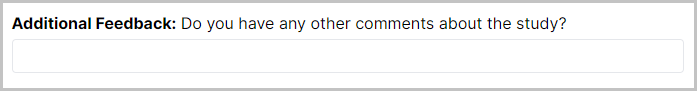
A large text area enables a large text input area for a participant to write open responses and longer answers to questions.

Samples that use this object
There are currently no samples that use this object.
Question
Type the question text for this object here.
Number of rows
Enter a number in this field to adjust the height of the Comment Box. This doesn't limit the amount of characters participants can write, it only adjusts the size.
Optional
If set, this question can be left unanswered.
Conditional
Control the conditions under which this question should be shown or hidden.
Default State
If conditional, set whether this question should be shown or hidden by default.
Conditions
If conditional, the conditions under which this question should be shown or hidden.
Visibility
Select, from the dropdown, whether this question should be shown or hidden under the condition.
Field
Set the field to use for this condition.
Comparison
Select the type of comparison, from the dropdown, to make for this condition.
Response
Set the response value to compare to the field in this condition.
Save To Store
If set, save this response to a field in the Store. Learn more about the Store in the Binding Guide.
Destinations
The list of destinations where this response will be Stored.
Save
Choose 'Value' from the dropdown so that the participant's input in the Comment Box gets saved to the Store.
To
Set the field in the Store which you would like to save the response to.
The Consent Form is a special version of the Multiple Choice Grid object, with some default settings filled in to make it a useful template for collecting consent from participants.

Samples that use this object
Question
Type the question text for this object here.
Use separate Responses and Labels
If set, allows you to specify separate labels (displayed to the participant) and responses (shown in your data). By default, this will be set.
Response Options (columns)
List of options for this consent form's columns. By default, this will contain one option with the Response 'consent' and the Label 'I Agree'.
Response
The response value for this option - this is the response that will actually be stored.
Label
The label for this option - this is what will be shown to the participant. You can use Markdown to format this text.
Questions/Statements (rows)
List of questions/statements for this consent form's rows. By default, this will contain one statement with some default consent text.
Response
The response value for this question/statement - this is the response that will actually be stored.
Label
The label for this question/statement - this is what will be shown to the participant. You can use Markdown to format this text.
Allow multiple answers per row
If set, allow multiple answers to be selected using checkboxes. By default, this will be set, as the convention is for consent forms to use checkboxes rather than radio buttons.
Use Mobile Layout
When to use mobile-friendly layout for this question.
Randomise Row Order
Randomises the order of row options within the consent form.
Show separating line between rows
If set, a horizontal line will be displayed between rows.
Optional
If set, allow this question to be left unanswered. If you allow it to be left unanswered, the response field in your data could be either empty (if the participant has chosen not to answer this question) or include a 1 (if the participant ticked that question).
Conditional
Control the conditions under which this question should be shown or hidden.
Default State
If conditional, set whether this question should be shown or hidden by default.
Conditions
If conditional, the conditions under which this element should be shown or hidden.
Visibility
Select, from the dropdown, whether this question should be shown or hidden under the condition.
Field
Set the field to use for this condition.
Comparison
Select the type of comparison, from the dropdown, to make for this condition.
Response
Set the response value to compare to the field in this condition.
Save To Store
If set, save this response to a field in the store. Learn more about the Store in the Binding Guide.
Destinations
The list of destinations where this response will be Stored.
Save
Choose, from the dropdown, which of this question's response fields to save to the Store. If you have only one checkbox, the only option will be the combination of the Question label and the Response Option label. If you have several Questions and several Response Options, all combinations will appear here and you can choose one.
To
Set the field in the Store which you would like to save the response to.
The Date Entry object adds 3 dropdown menus: 'Day', 'Month' and 'Year', which participants can use to specify a date. A use case for this object may be to ask participants their date of birth. The settings can be used to collect the date in months and years only, which is useful to collect GDPR compliant age data.

Samples that use this object
Language Experience Questionnaire
Question
Type the question text for this object here.
Convert to Age
If set, interpret the participant's input as a birth date and store the number of years, months and days between that date and the current date.
Convert to Months
If set, interpret the participant's input as a birth date and store the number of months only.
Month & Year Only
If set, do not display the dropdown menu for 'Day'. This allows you to collect a date from the participant without a day. Or, collect participant ages that are accurate to years and months, but without effectively storing dates of birth (which are de-anonymising).
Optional
If set, this question can be left unanswered.
Conditional
Control the conditions under which this question should be shown or hidden.
Default State
If conditional, set whether this question should be shown or hidden by default.
Conditions
If conditional, the conditions under which this question should be shown or hidden.
Visibility
Select, from the dropdown, whether this question should be shown or hidden under the condition.
Field
Set the field to use for this condition.
Comparison
Select the type of comparison, from the dropdown, to make for this condition.
Response
Set the response value to compare to the field in this condition.
Save To Store
If set, save this response to a field in the Store. Learn more about the Store in the Binding Guide.
Destinations
The list of destinations where this response will be Stored.
Save
Choose, from the dropdown, which of this question's response fields (Day, Month or Year) to save to the Store. If you want to branch based on age, consider using Multiple Choice or Number Entry instead.
To
Set the field in the Store which you would like to save the response to.
A simple dropdown menu where participants select an answer from a list of options you have provided. This is useful when you wish participants to select an answer from a set of pre-defined options.

Samples that use this object
Language Experience Questionnaire
Question
Type the question text for this object here.
Use separate Responses and Labels
If set, allows you to specify separate labels (displayed to the participant) and responses (shown in your data).
Options
Add the list of options you wish to provide for this question.
Response
The response value for this option - this is the response that will actually be stored.
Label
The label for this option - this is what will be shown to the participant.
Allow 'Other'
If set, adds an "Other" option to the dropdown, with a conditional text box response when selected.
'Other' option label
Label for your 'Other' option, which participants will see.
Randomise Order
Randomises the order of options within the dropdown.
Optional
If set, this question can be left unanswered.
Conditional
Control the conditions under which this question should be shown or hidden.
Default State
If conditional, set whether this question should be shown or hidden by default.
Conditions
If conditional, the conditions under which this question should be shown or hidden.
Visibility
Select, from the dropdown, whether this question should be shown or hidden under the condition.
Field
Set the field to use for this condition.
Comparison
Select the type of comparison, from the dropdown, to make for this condition.
Response
Set the response value to compare to the field in this condition.
Save To Store
If set, save this response to a field in the Store. Learn more about the Store in the Binding Guide.
Destinations
The list of destinations where this response will be Stored.
Save
Choose, from the dropdown, which of this question's response fields to save to the Store.
To
Set the field in the Store which you would like to save the response to.
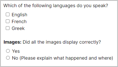
A list of pre-defined options that a participant can choose from. If multiple answers are allowed, the options will be presented as a Checklist. If only one option can be chosen by participants, they will be displayed as Radio buttons.

Samples that use this object
Generic Pilot Feedback Questionnaire
Question
Type the question text for this object here.
Use separate Responses and Labels
If set, allows you to specify separate labels (displayed to the participant) and responses (shown in your data).
Allow 'Other'
If set, adds an "Other" option to the list, with a conditional text box response when selected.
'Other' option label
Label for your "Other" option, which participants will see.
Options
Add the list of options you wish to provide for this question.
Response
The response value for this option - this is the response that will actually be stored.
Label
The label for this option - this is what will be shown to the participant.
Allow multiple answers
If set, allow multiple answers to be selected using checkboxes. By default, only a single answer can be selected using radio buttons.
Randomise Order
Randomises the order of multiple choice options.
Optional
If set, this question can be left unanswered.
Conditional
Control the conditions under which this question should be shown or hidden.
Default State
If conditional, set whether this question should be shown or hidden by default.
Conditions
If conditional, the conditions under which this question should be shown or hidden.
Visibility
Select, from the dropdown, whether this question should be shown or hidden under the condition.
Field
Set the field to use for this condition.
Comparison
Select the type of comparison, from the dropdown, to make for this condition.
Response
Set the response value to compare to the field in this condition.
Save To Store
If set, save this response to a field in the Store. Learn more about the Store in the Binding Guide.
Destinations
The list of destinations where this response will be Stored.
Save
If your question is set up to allow multiple answers, you can select which answer to save to the Store. Responses will be saved as 1 if the answer was ticked, and 0 if it was not ticked.
If your question only allows a single answer, you can select whether you want this answer to be saved as the Response (i.e. the actual answer the participant selected), or Quantised (i.e., the number corresponding to the answer's position in the list of response options).
To
Set the field in the Store which you would like to save the response to.
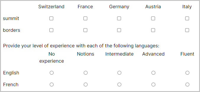
Pick responses from a list of options using radio buttons or checkboxes, arranged in a grid.

Samples that use this object
Language Experience Questionnaire
Barratt Impulsiveness Scale (BIS-11)
Question
Type the question text for this object here.
Questions/Statements (rows)
List of questions or statements for this multiple choice grid's rows.
Response
The response value for this question/statement - this is the response that will actually be stored.
Label
Only available when 'Use separate Responses and Labels' setting is toggled on. The label for this question/statement - this is what will be shown to the participant. You can use Markdown to format this text.
Response Options (columns)
Add the list of options you wish to provide for this multiple choice grid's columns.
Response
The response value for this option - this is the response that will actually be stored.
Label
Only available when 'Use separate Responses and Labels' setting is toggled on. The label for this option - this is what will be shown to the participant. You can use Markdown to format this text.
Allow multiple answers per row
If set, allow multiple answers to be selected using checkboxes. By default, only a single answer can be selected in each row using radio buttons.
Use separate Responses and Labels
If set, allows you to specify separate labels (displayed to the participant) and responses (shown in your data).
Use Mobile Layout
When to use mobile-friendly layout for this question.
Randomise Row Order
Randomises the order of row options within the multiple choice grid.
Show separating line between rows
If set, a horizontal line will be displayed between rows.
Optional
If set, allow this question to be left unanswered.
Conditional
Control the conditions under which this question should be shown or hidden.
Default State
If conditional, set whether this question should be shown or hidden by default.
Conditions
If conditional, the conditions under which this question should be shown or hidden.
Visibility
Select, from the dropdown, whether this question should be shown or hidden under the condition.
Field
Set the field to use for this condition.
Comparison
Select the type of comparison, from the dropdown, to make for this condition.
Response
Set the response value to compare to the field in this condition.
Save To Store
If set, save this response to a field in the Store. Learn more about the Store in the Binding Guide.
Destinations
The list of destinations where this response will be Stored.
Save
Choose, from the dropdown, which of this question's Statements (rows) to look at, so that its response option(s) chosen by the participant gets saved to the Store.
If your question is set up to allow multiple answers, you can select which answer to save to the Store. Responses will be saved as 1 if the answer was ticked, and 0 if it was not ticked.
If your question only allows a single answer, you can select whether you want this answer to be saved as the Response (i.e. the actual answer the participant selected), or Quantised (i.e., the number corresponding to the answer's position in the list of response options).
To
Set the field in the Store which you would like to save the response to.
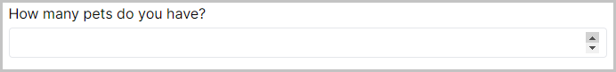
Enter a single number. Limits can be set on the minimum and maximum values for this number.

Samples that use this object
There are currently no samples that use this object.
Question
Type the question text for this object here.
Use Limits
Allows the entered number to be clamped (restricted) to a range.
Minimum
Minimum value allowed for the number.
Maximum
Maximum value allowed for the number.
Optional
If set, this question can be left unanswered.
Conditional
Control the conditions under which this question should be shown or hidden.
Default State
If conditional, set whether this question should be shown or hidden by default.
Conditions
If conditional, the conditions under which this question should be shown or hidden.
Visibility
Select, from the dropdown, whether this question should be shown or hidden under the condition.
Field
Set the field to use for this condition.
Comparison
Select the type of comparison, from the dropdown, to make for this condition.
Response
Set the response value to compare to the field in this condition.
Save To Store
If set, save this response to a field in the Store. Learn more about the Store in the Binding Guide.
Destinations
The list of destinations where this response will be Stored.
Save
Choose 'Value' to save the number participants entered to the Store.
To
Set the field in the Store which you would like to save the response to.
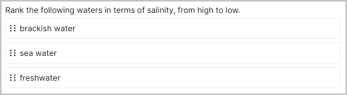
A set of response options presented in a vertical list created from a list of options you provide. Participants can drag and drop to change the order of the list to provide a ranking of all the options.

Samples that use this object
Question
Type the question text for this object here.
Use separate Responses and Labels
If set, allows you to specify separate labels (displayed to the participant) and responses (shown in your data).
Options
Add the list of options you wish to provide for this question.
Response
The response value for this option - this is the response that will actually be stored.
Label
The label for this option - this is what will be shown to the participant.
Randomise Order
Randomises the order in which options are initially presented on the screen.
Top Label
The label that will be shown to the top of the ranking.
Bottom Label
The label that will be shown to the bottom of the ranking.
Optional
If set, allow this question to be left unanswered.
Conditional
Control the conditions under which this question should be shown or hidden.
Default State
If conditional, set whether this question should be shown or hidden by default.
Conditions
If conditional, the conditions under which this question should be shown or hidden.
Visibility
Select, from the dropdown, whether this question should be shown or hidden under the condition.
Field
Set the field to use for this condition.
Comparison
Select the type of comparison, from the dropdown, to make for this condition.
Response
Set the response value to compare to the field in this condition.
Save To Store
If set, save this response to a field in the store. Learn more about the Store in the Binding Guide.
Destinations
The list of destinations where this response will be Stored.
Save
Choose, from the dropdown, which of this question's response fields to save to the Store. To save the item that was dragged into a particular position, select the item that was originally listed in that position. For example, to save the item that was dragged into first position, select the response that was originally in first position.
To
Set the field in the Store which you would like to save the response to.
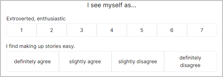
A set of response options presented in a horizontal line created from a list of options you provide. From these options, participants can choose a single response. This is often used when participants are asked to provide a rating based on an image or sentence.

Samples that use this object
Patient Health Questionnaire (PHQ-9)
Generalised Anxiety Disorder (GAD 7)
Question
Type the question text for this object here.
Use separate Responses and Labels
If set, allows you to specify separate labels (displayed to the participant) and responses (shown in your data).
Options
Add the list of options you wish to provide for this question.
Response
The response value for this option - this is the response that will actually be stored.
Label
The label for this option - this is what will be shown to the participant.
Add multiple questions/items
Allows you to repeat the same set of options for multiple items.
Items
List of items to show for the rating scale alongside your options.
Left Label
The label that will be shown to the left of the scale.
Right Label
The label that will be shown to the right of the scale.
Rating Item Size (px)
Size that will be used for the items in the rating scale.
Use Mobile Layout
When to use mobile-friendly layout for this question.
Optional
If set, this question can be left unanswered.
Conditional
Control the conditions under which this question should be shown or hidden.
Default State
If conditional, set whether this question should be shown or hidden by default.
Conditions
If conditional, the conditions under which this question should be shown or hidden.
Visibility
Select, from the dropdown, whether this question should be shown or hidden under the condition.
Field
Set the field to use for this condition.
Comparison
Select the type of comparison, from the dropdown, to make for this condition.
Response
Set the response value to compare to the field in this condition.
Save To Store
If set, save this response to a field in the Store. Learn more about the Store in the Binding Guide.
Destinations
The list of destinations where this response will be Stored.
Save
Choose, from the dropdown, either the response or the quantised response of this question's response fields to save to the Store. The quantised response corresponds to the position of the response in your rating scale (from 1 to however many response options you have).
To
Set the field in the Store which you would like to save the response to.
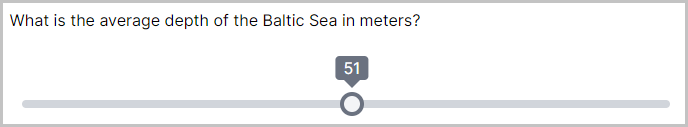
A simple slider, which allows participants to choose a value within the range you set. This object is useful if you require participants to give an answer between a range of values, or rate something on a scale. The range is 0-100 by default, but you can use the 'Custom Range' setting to specify your own.
The start position of the slider handle defaults to the middle of the slider. When using the "Fixed Start Position" setting, the slider handle will start at the position specified by "Starting value". When using the "Random Start Position" setting, the slider handle will start at a random position between the "Starting value (min)" and "Starting value (max)".

Samples that use this object
Question
Type the question text for this object here.
Custom Range
Toggle this setting on to use a custom range for this slider. By default, sliders range from 0 to 100.
Minimum Value
When using a Custom Range, sets the minimum value on the slider.
Maximum Value
When using a Custom Range, sets the maximum value on the slider.
Fixed Start Position
Toggle this setting on to specify a fixed start position for the slider handle. By default, the slider handle will start in the middle of the range.
Starting value
When using Fixed Start Position, sets the start position for the slider handle.
Random Start Position
Toggle this setting on to randomise the start position for the slider handle.
Starting value (min)
When using Random Start Position, sets the minimum starting value. The actual value will be between this and the maximum value.
Starting value (max)
When using Random Start Position, sets the maximum starting value. The actual value will be between this and the minimum value.
Add Labels
Toggle this setting on to add labels to the ends of the slider.
Left-side label
When using Add Labels, defines the label to display to the left end of the slider.
Right-side label
When using Add Labels, defines the label to display to the right end of the slider.
Show tooltip
Toggle this setting on to show the current value above the slider in a tooltip (speech bubble).
Hide handle until click
Toggle this setting on to hide the slider handle until the participant first clicks the slider.
Step Size
Sets the step size for the slider. You can enter a whole number or a decimal value.
Optional
If set, this question can be left unanswered.
Conditional
Control the conditions under which this question should be shown or hidden.
Default State
If conditional, set whether this question should be shown or hidden by default.
Conditions
If conditional, the conditions under which this question should be shown or hidden.
Visibility
Select, from the dropdown, whether this question should be shown or hidden under the condition.
Field
Set the field to use for this condition.
Comparison
Select the type of comparison, from the dropdown, to make for this condition.
Response
Set the response value to compare to the field in this condition.
Save To Store
If set, save this response to a field in the Store. Learn more about the Store in the Binding Guide.
Destinations
The list of destinations where this response will be Stored.
Save
Choose 'Value' to save the slider position participants selected to the Store.
To
Set the field in the Store which you would like to save the response to.
The Text Entry object allows participants to enter a single line of text. It is useful if you wish to collect data from simple 'open', 'short-answer' questions. By toggling on the 'Add multiple questions/items', you will be able to create several single line response boxes with a label next to each one.

Tutorials that use this object
Question
Type the question text for this object here.
Add multiple questions/items
Allows you to create a series of text input boxes for multiple items, which can be labelled in the list of items (see setting below). If this is toggled on, make sure to define at least one item in the list of items. The label you have given will then appear next to the response box.
Items
List of items to show. A text input box will be provided alongside each item.
Optional
If set, this question can be left unanswered.
Conditional
Control the conditions under which this question should be shown or hidden.
Default State
If conditional, set whether this question should be shown or hidden by default.
Conditions
If conditional, the conditions under which this question should be shown or hidden.
Visibility
Select, from the dropdown, whether this question should be shown or hidden under the condition.
Field
Set the field to use for this condition.
Comparison
Select the type of comparison, from the dropdown, to make for this condition.
Response
Set the response value to compare to the field in this condition.
Save To Store
If set, save this response to a field in the Store. Learn more about the Store in the Binding Guide.
Destinations
The list of destinations where this response will be Stored.
Save
Choose 'Value' to save participants' text entry response to the Store. If you have ticked 'Add multiple questions/items', you will be able to select which question's response you want to save.
To
Set the field in the Store which you would like to save the response to.
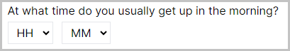
The Time Entry object adds 2 dropdown menus to the screen: 'Hour' and 'Minute', which participants can use to specify a time.

Samples that use this object
There are currently no samples that use this object.
Question
Type the question text for this object here.
Optional
If set, this question can be left unanswered.
Conditional
Control the conditions under which this question should be shown or hidden.
Default State
If conditional, set whether this question should be shown or hidden by default.
Conditions
If conditional, the conditions under which this question should be shown or hidden.
Visibility
Select, from the dropdown, whether this question should be shown or hidden under the condition.
Field
Set the field to use for this condition.
Comparison
Select the type of comparison, from the dropdown, to make for this condition.
Response
Set the response value to compare to the field in this condition.
Save To Store
If set, save this response to a field in the Store. Learn more about the Store in the Binding Guide.
Destinations
The list of destinations where this response will be Stored.
Save
Choose, from the dropdown, which of this question's response fields (Hours or Minutes) to save to the Store.
To
Set the field in the Store which you would like to save the response to.
Allows the participant to switch to another task/questionnaire attached via a Switch Node in the experiment tree. This can be useful if you want to use a questionnaire for task instructions and enable participants to navigate between these instructions and the task.
Samples that use this object
There are currently no samples using this object.
Button Label
Text for the 'Switch' button.
Conditional
Control the conditions under which this object should be shown or hidden.
Default State
If conditional, set whether this object should be shown or hidden by default.
Conditions
If conditional, the conditions under which this object should be shown or hidden.
Visibility
Select, from the dropdown, whether this object should be shown or hidden under the condition.
Field
Set the field to use for this condition.
Comparison
Select the type of comparison, from the dropdown, to make for this condition.
Response
Set the response value to compare to the field in this condition.